All Articles
10 reasons why the design of your website is not working

Alina Temchenko
Designer at Rozdoum
Here are 10 best rules of Adaptive Web Design. Rozdoum experts analyzed and combined the best technics for creating perfect Website Design… Your site should not only attract visitors, but also keep them.
Website design is the first thing that draws the attention of the user. The design itself is only a space for content, but everything on the website must be perfect and harmonious. Website design should not only attract visitors, but also keep them. Have you ever wondered why one design works while another one doesn’t? Today we will lay out for you 10 key reasons why the design of your site may or may not be working.
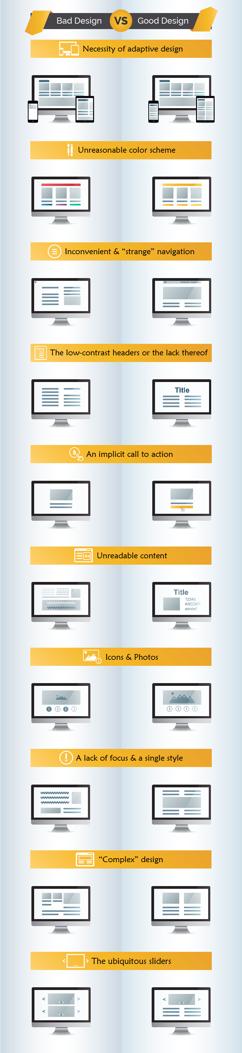
1. Adaptive design? No, I have never even heard of this
Website design, which was developed without taking into account the features of mobile devices, brings a great discomfort to its visitors. Google displays links of mobile-friendly websites higher in search results. According to statistics, more than 30% of users leave sites that are not yet mobile friendly. If you have mobile data traffic, but the design of your website is not optimized for mobile devices, you will lose the lion’s share of your audience and receive less conversion from the site.
2. Unreasonable color scheme
Color is one of the most powerful instruments of influence on the human consciousness. The wrong selection of colors substantially reduces the effectiveness of your site. Each color contains a specific meaning and has a special effect on a person. Choose colors carefully, based on your site’s goals. A good combination of harmonious colors will enhance the perception and memorization of the content displayed on your website. An optimal variant of colors is 2-3.
3. Inconvenient and “strange” navigation
Another valid reason to leave a website is because it is not logically structured and thus difficult to navigate. Why does anyone need a website where it’s impossible to find necessary information? Don’t forget about the “Golden Rule” of navigation: Think about the website as a visitor, not the owner. Make navigation easy and intuitive.
4. The low-contrast, implicit headers or the lack thereof
Scientific evidence shows that on average, users read the headlines 5 times more often than all the text. Its main purpose is to attract the attention of the user. Titles should be clear, informative, unique, effective and distinct from the main text on the site.
5. An implicit call to action
Call-to-action (CTA) is the second most important item after the title. It convinces a potential customer to make key clicks, leading to a purchase, an order or registration. The style of CTA buttons must be created in such way, that after the click, the user understands what action will follow.
6. Unreadable content
The font, color, size and background colors influence the speed and simplicity with which the user perceives the content. Choose no more than 2-3 attractive and readable fonts, which are easily displayed in browsers. Remember that good typography affects the behavior of users and their solutions.
7. Icons and photos
A large number of various icons and pictures with low definition considerably spoils the impression about the site. Use a reasonable number of icons, which are created in a common style, and high-quality images. It is important to match the visual view of the website with its content.
8. A lack of focus and a single style
The user should feel comfortable when he\she visits the website. The balance of aesthetics and convenience is paramount when creating a successful design. Observe the importance of a hierarchy of elements, and a common design style. Use color accents for certain elements to help users work with your website.
9. “Complex” design
A necessary part of website design is observing a sense of proportion. A nice picture should not interfere with how the user perceives the content of the website. It is very important that the end your website does not look like a victim of design trends over a sense of reality and logical connections. Use less details and more empty space to improve the visual hierarchy. Place the content in the proper sequence.
10. The ubiquitous sliders
Sliders can add variety and order to your website. However, they can also turn your website into a complete chaos. Using sliders can mercilessly clutter resources and scare users. You should remember that a good design is making something intelligible and memorable, but a great design is making something memorable and meaningful. We wish you the best of luck with your website design!
Get a Free Quote Today for Web Design & Development from Rozdoum team.
Alina Temchenko
Designer at Rozdoum

Stay on Top of the Latest IT Software Development Tips, Newest Offshore Trends, and Best Outsourcing Practices.
Technical Background
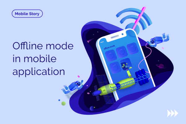
Why Your Business App Needs Offline Mode
Smartphones are now associated with the word ‘mobile’, whereas they are preferably a response to an increasingly fast-paced lifestyle. Read more …

Technical Background
Ready. Steady. Goal! How Mobile Developer Can Grow from Championship
Rozdoumites have proved the reputation of an open-minded and innovative team. Our mobile Android developer, Alexey, has joined the 12-th DEV Challenge, a Ukrainian Competition of minds, skills, and knowledge for developers. Read more …
Technical Background
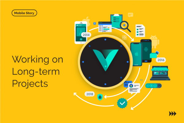
Difficulties & Discoveries of Working on Long-term Projects
For a service business, long-term projects may seem the most desirable and beneficial. Clients with a persistent strategy of development can guarantee that there will be work to do for several years. Read more …