All Articles
The global battle between the website designs of outsourcing titans: Trends VS Classics
Rozdoum Design team conducted an insightful analysis of latest trends in Website Design among top 100 IT outsourcing Companies around the world.
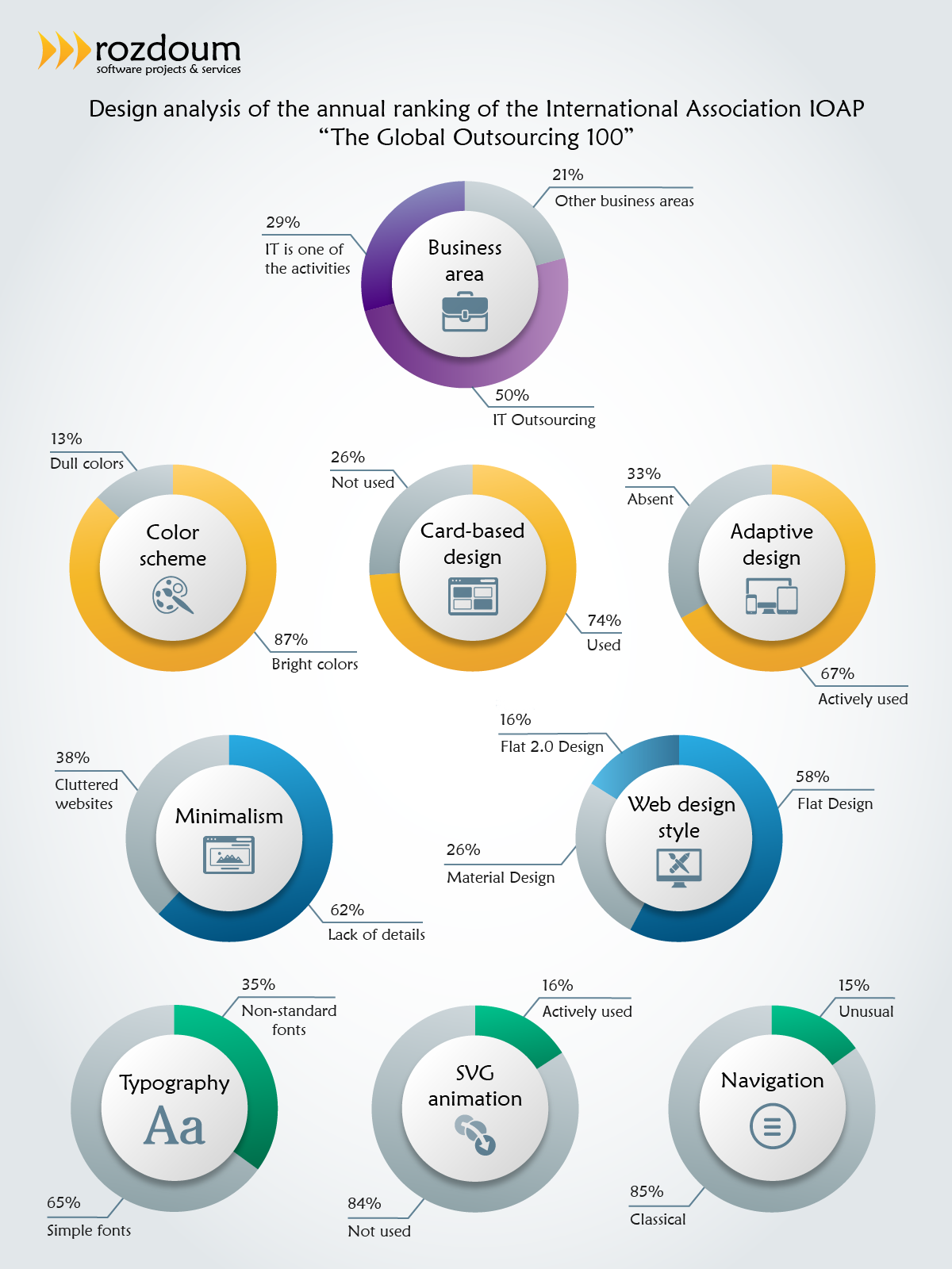
Do you know that 33% of IT Companies still don’t use Adaptive Design for their Websites?
Our team pays close attention to new technologies and permanent changes that occur within the trends of the IT sphere. Web design is no exception. This rapidly growing field also has its own trends, which quickly follow one another. So, what happens with the website designs that are created by the best outsourcing companies in the world? What web design trends are front and center among the most popular outsourcing companies this year? A contemporary trend, a classical trend, perhaps a mix of the two or even somewhere in between.
Today, we are excited to share with you a brief analysis of the top 100 companies which outsource website designs.
We have analyzed the annual ranking of the International Association IOAP “The Global Outsourcing 100” and have identified and outlined 8 major trends for you.
- Rich colors have proven to be the most successful! Dull, boring, “faded” colors are in the deep past. A variety of bright pastels and bold color accents have filled the resources of major outsourcing companies.
- Card-based design is gaining momentum. Card-based design not only looks good, but is also highly functional due to its simplicity.
- Adaptive design is the key trend this year. It has already become a standard and will probably not lose its relevance in the near future. Above all it is easy and compatible with a variety of devices!
- Minimalism has become an absolute perfection. Sites are simplified as much as possible by using a card design, free space and brief informative content. We’d like to point out that the absence of advertising is a very pleasant trend.
- Flat design actively displaces a Material design. It is combined perfectly with other styles and makes a more intuitive interface for the visitor. It is not distractive for someone who has attention to detail. Among all the styles, Flat 2.0 (“almost flat”) style has also gained popularity. It combines the elements of a flat design with realism. It allows you to add depth and complexity to the web site design, and does not compromise the minimalistic elements (e.g. using the reflection of objects, long shadows, gradients, etc.)
- The typography trend is aimed at readability. The usage of simple fonts allows you to focus on content rather than on the letters.
- SVG-animation has also become more popular. Its simplicity and responsiveness has been gradually conquering the hearts of its users. SVG boldly displaces Flash, but it is not a priority, compared with an adaptive and/or card-based design.
- Classical navigation is difficult to work with. Companies that use the desktop version of the site refuse to use the “hamburger” icon, which hides menu items, and other unusual navigation tools in favor of the standard “visible” elements. This is due to the fact that convenient and intuitive navigation has become key to a high conversion rate!
Generally, the website design of outsourcing titans is focused on its user friendliness. Trends and classic techniques complement each other, making the design more diverse, interesting and unique.
Rozdoum strives to identify market trends early and map our deep market research insights to the strategies of our clients.
Don’t forget that Rozdoum has dedicated designers that can help you with your website or application design as well.
If you’re interested in finding out more about design trends, here is our the most popular articles:
10 reasons why the design of your website is not working
Checklist. How to quickly and easily create a cool infographic

Stay on Top of the Latest IT Software Development Tips, Newest Offshore Trends, and Best Outsourcing Practices.


