All Articles
Do it Right: Make the Colour Scheme for a Mobile Application

Alina Temchenko
Designer at Rozdoum
Choosing a color scheme is the essential part of designing a user interface. Colors have a powerful impact on the usability and the attraction of a mobile application. What are the key factors influencing the choice of a general color theme? How do you find the best solution for a design and also make it worth your money? Which color scheme fits the best?
In UI design, a color is a multifunctional tool that can serve several goals simultaneously:
- increase intuitive interaction,
- enhance the call to action,
- highlight navigation and elements,
- demonstrate the readability of the content,
- assure brand identification and brand recognition,
- create a sense of harmony and style,
- garnish visual performance, and
- satisfy aesthetic sensitivity.
Tailoring the color scheme of the user interface doesn’t take magic, but it is time-consuming. A level of consistency needs to be achieved, and one need to work hard with information and the combination of colors. The following steps can help you succeed in selecting an effective color scheme:
- Define the product utility and set clear goals. At an early stage, it is vital to determine the exact cause of any frustration on the user’s side (which the mobile application will address) and find ways to solve the problem. This stage forms the basis and content of the user interface.
- Study the target audience. Information about potential users, their wishes and expectations provide a solid foundation for creating an efficient, convenient and attractive interface. The target audience may have typical color preferences that can also serve as a good clue for choosing a color scheme.
- Conduct a competitor analysis. It is not a complicated thing to search for existing mobile applications on the market, compare them, identify the standard design rules for the niche and make your product unique and distinctive. Analyzing a competitor’s color scheme is not a waste because it protects your design from being incompetent, and it saves your resources in case you need to redesign the project.
- Test usability. Check the strengths and weaknesses of the chosen color scheme before a mobile application enters the market. Your product has only one chance to make a good first impression on the user, so it’s very important to test the design in different resolutions, on different screens, devices and under different conditions.
- The analysis of standard/potential conditions (environmental factors) under which the product will be regularly/frequently used by the target audience can reveal additional pros and cons regarding the choice of the color scheme. For example, depending on the illumination level and the screen type, you will combine the colors, the shades, and work with the contrast of visual elements.
- Think of the content, determine its quantity and nature. The number and the size of elements, blocks, and text on the screen has a direct impact not only on the background color but also on the color solution and the level of the contrast of all components in general.
- Provide a final test with the help of a black-and-white screen and with the blur effect test. This is a simple method not only to detect insufficient color combinations but also to test your interface for a user with deficient color vision. If all the functional elements are noticeable and prominent without color, congratulations, you have made the right choice!
Remember that the aim of the interface is not limited only by the transmission of a visual message. It is intended for a pleasant and successful user interaction with the product. So, it is better not to neglect any of the mentioned above steps, and avoid “dirt” on the screen. The color scheme should be clean, simple and concise. Clarity improves usability and helps readability, assuring the user is entertained.
For many years in the world of design, the endless discussion continues. The core point of the dispute is which of the color scheme is better: dark-on-light (light background with dark text or dark-colored text on a light background), or light-on-dark (dark background with light text / light-colored text on a dark background)? A dark design can be as effective as a light one if the layout elements are designed properly. Take into account the following details:
| Dark-on-light | Light-on-dark | |
| Readability |
In a light design, it is better not to use low-contrast and very bright colors for fonts. |
In a dark design, block letters are better perceived. Good readability on a dark background depends on the amount of empty space, contrast, and the sizes of various elements. |
| Contrast |
A light color scheme creates the effect of a big and airy screen. It helps the user focus on the text. |
The dark color theme is effective and engaging for interfaces full of graphic content, not the text. |
|
Emotional resonance |
Light colors are associated with cleanliness, perfectness, and kindness. They make users feel trust and positive emotions. This scheme is the good old classics of UI design. |
Dark colors symbolize elegance, trustworthiness, prestige, substantiality, and mystery, and emphasize the depth of visual representation of content. |
An efficient and universal color scheme is a myth because the design of every project is unique and requires an individual approach.
Choosing a color scheme when creating a mobile application is a serious and responsible task. A designer should not be guided only by their own perception and personal color preferences. All users see and perceive colors in different ways, due to different psychophysiological states. When creating a color scheme, pay attention to every detail. Do not be afraid to play with colors and try new color combinations.
Alina Temchenko
Designer at Rozdoum

Stay on Top of the Latest IT Software Development Tips, Newest Offshore Trends, and Best Outsourcing Practices.
Technical Background
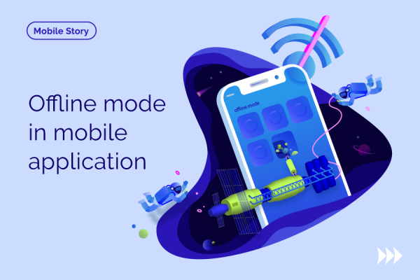
Why Your Business App Needs Offline Mode
Smartphones are now associated with the word ‘mobile’, whereas they are preferably a response to an increasingly fast-paced lifestyle. Read more …

Technical Background
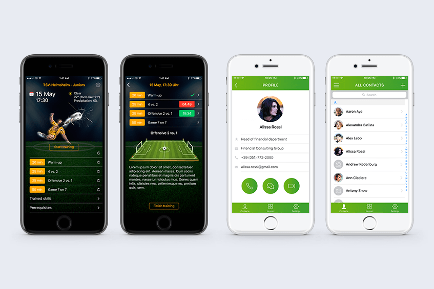
Ready. Steady. Goal! How Mobile Developer Can Grow from Championship
Rozdoumites have proved the reputation of an open-minded and innovative team. Our mobile Android developer, Alexey, has joined the 12-th DEV Challenge, a Ukrainian Competition of minds, skills, and knowledge for developers. Read more …
Technical Background
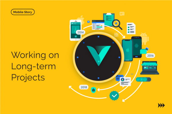
Difficulties & Discoveries of Working on Long-term Projects
For a service business, long-term projects may seem the most desirable and beneficial. Clients with a persistent strategy of development can guarantee that there will be work to do for several years. Read more …